
Overview
When Birmingham Open Studios approached YST, the brief was simple, refresh the logo for the next chapter of the city's annual open studio trail.
Looking a little deeper, we discovered an opportunity to do much more. Rather than replacing an identity that already carried recognition, we focused on strengthening what already existed. The result was a refined identity, campaign platform and visual language designed to celebrate Birmingham's artists, makers and creative spaces, while providing Birmingham Open Studios with a flexible brand system built to grow into the future.
This case study explores the strategy and creative process behind the rebrand. For a more personal reflection on the project, read Emma Woolley's Studio Notes article, The City That Makes Art.
-
Brand Strategy
Identity Refresh
Campaign Platform
Art Direction
Brand Guidelines
Social Media Toolkit
Printed Communications
-
Logo Refresh
Visual Language
Campaign Platform
Brand Guidelines
Social Toolkit
Artist Toolkit
Print Assets
The Brief
Birmingham Open Studios had built a recognisable identity over several years, but it lacked the consistency and flexibility needed for a growing city-wide event.
Our challenge wasn't to start again. It was to refine, strengthen and future-proof the existing identity while creating a brand that could confidently work across print, digital and the streets of Birmingham.
Rebuilding the Structure
Before putting pen to paper, we stepped back.
Rather than asking how we could redesign the logo, we asked what was already working.
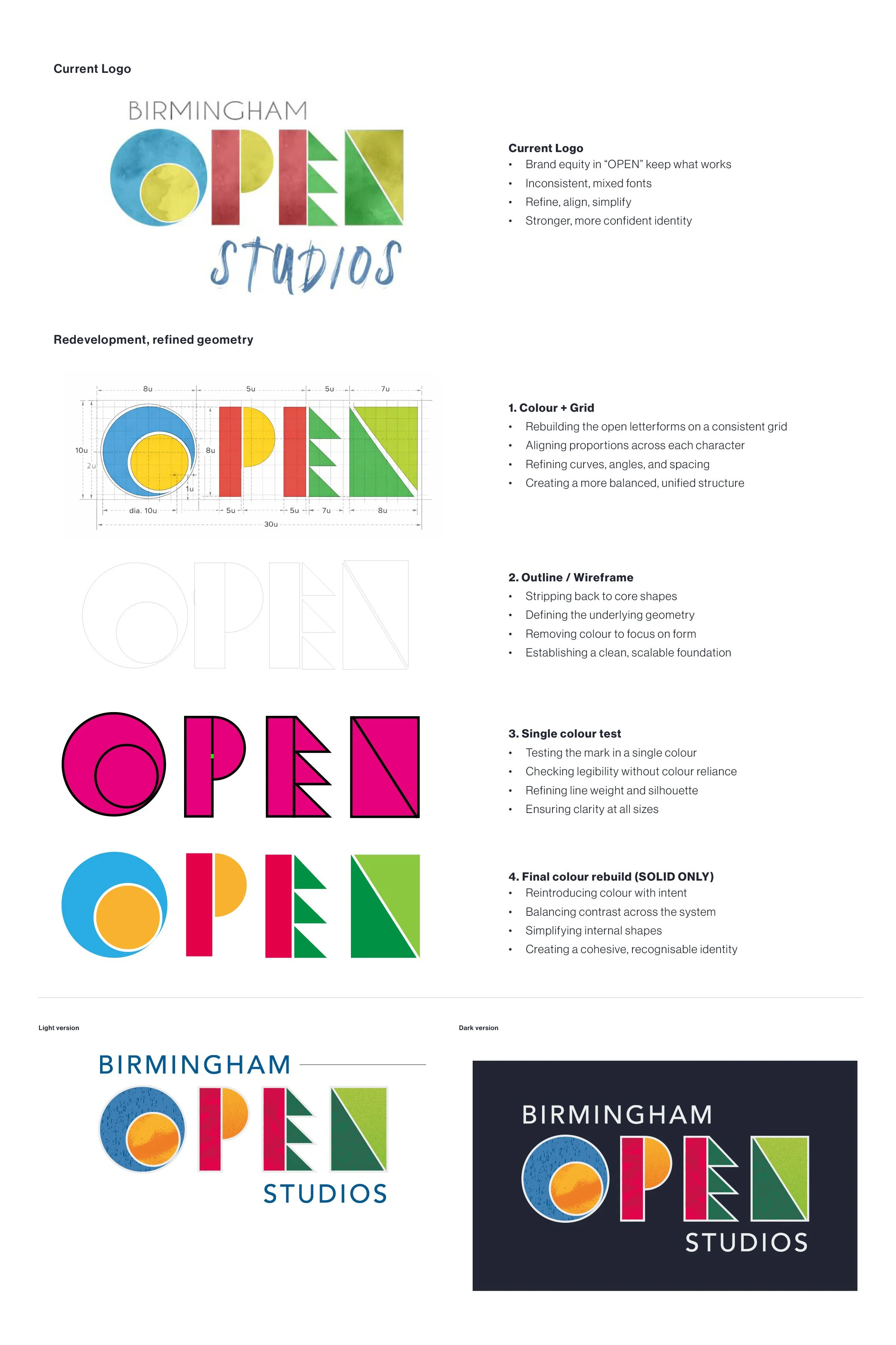
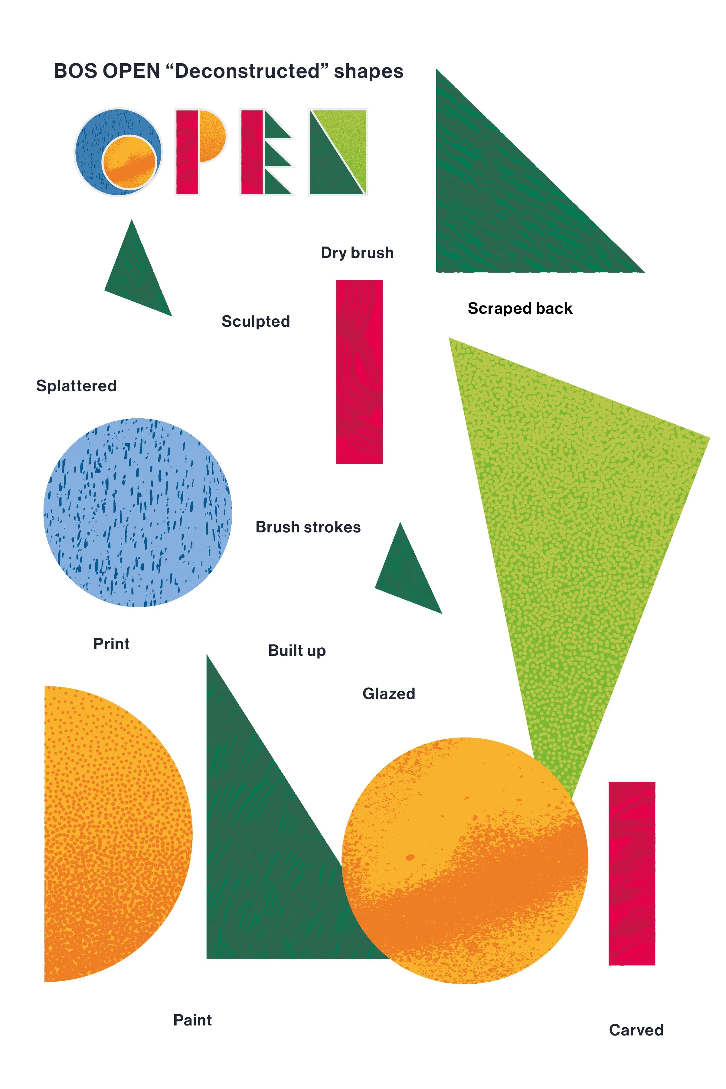
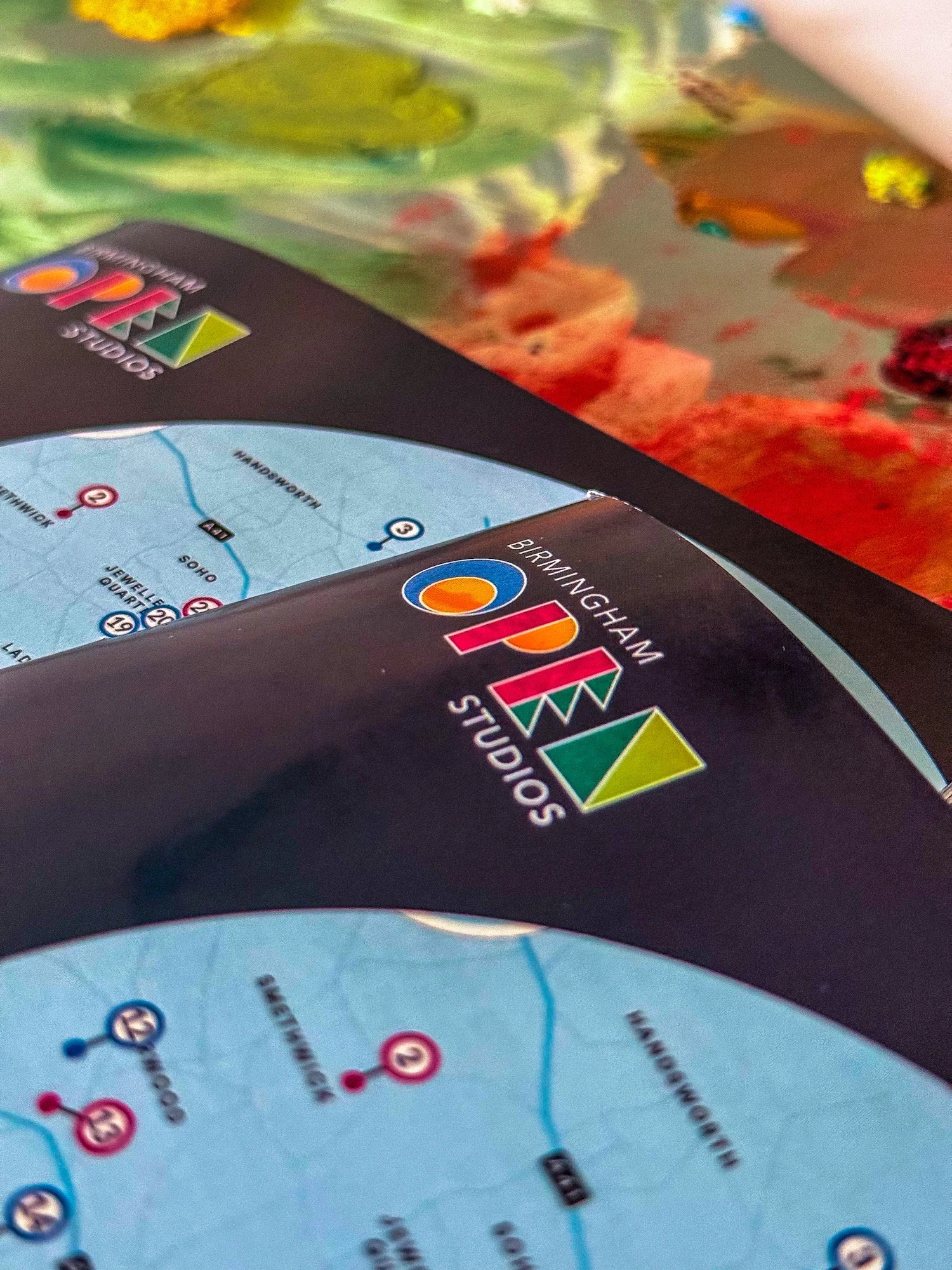
The OPEN marque had become one of Birmingham Open Studios' strongest assets. It was familiar, memorable and instantly recognisable, so instead of replacing it, we chose to rebuild it.
Every letter was carefully reconstructed using refined geometry, improved proportions and greater consistency, creating a stronger identity while preserving the character people already recognised.
Bringing Texture to Life
A technically perfect logo wasn't enough.
Birmingham Open Studios celebrates artists, makers and process, so the identity needed to reflect the physical act of making.
Inspired by printmaking, brushstrokes, carving, glazing and painted surfaces, we introduced handcrafted textures throughout the OPEN marque. These details gave the identity warmth, personality and a visual language rooted in artistic practice.
This City Makes ArtA refreshed identity deserved more than a logo launch.
It needed a statement.
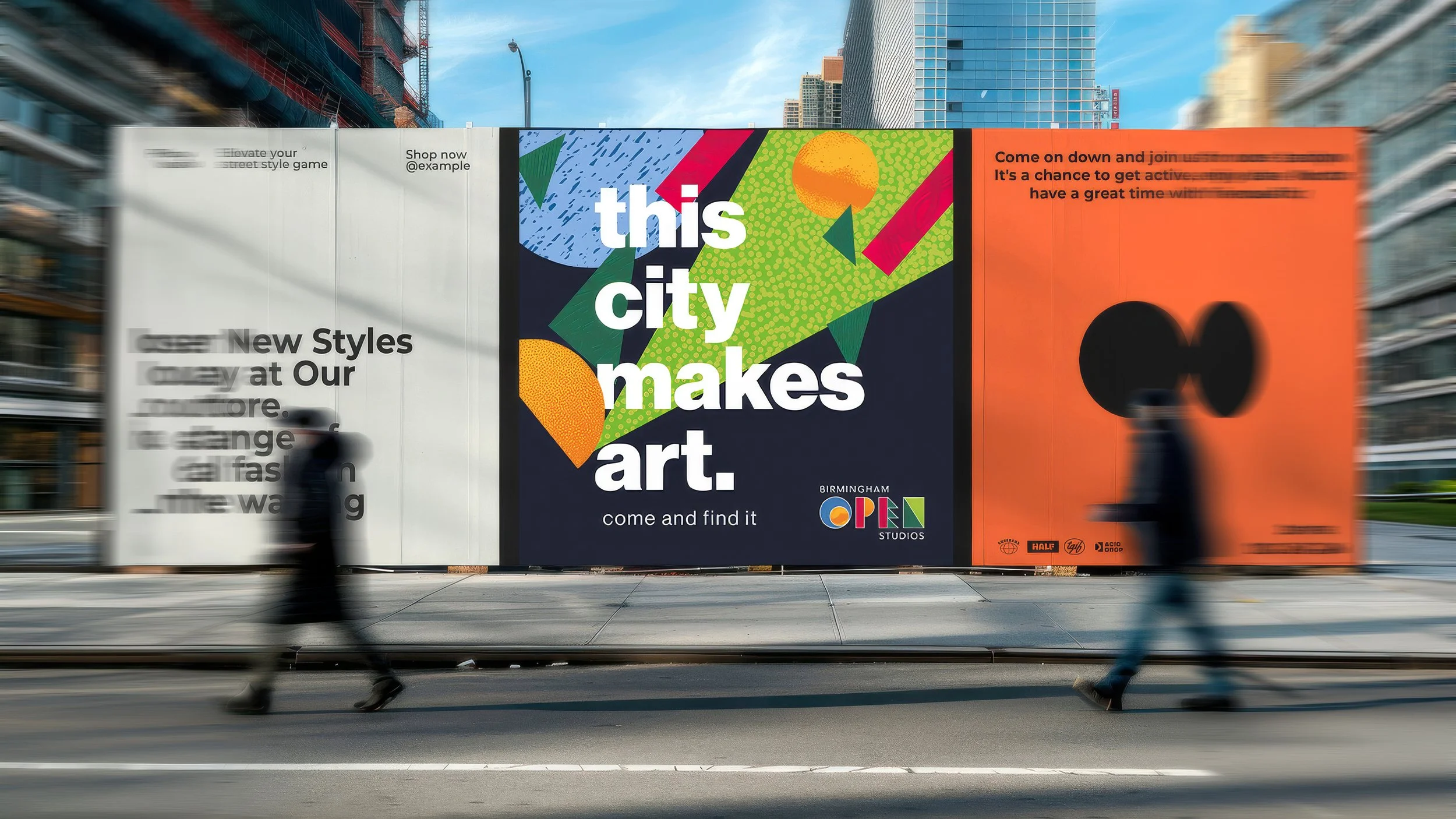
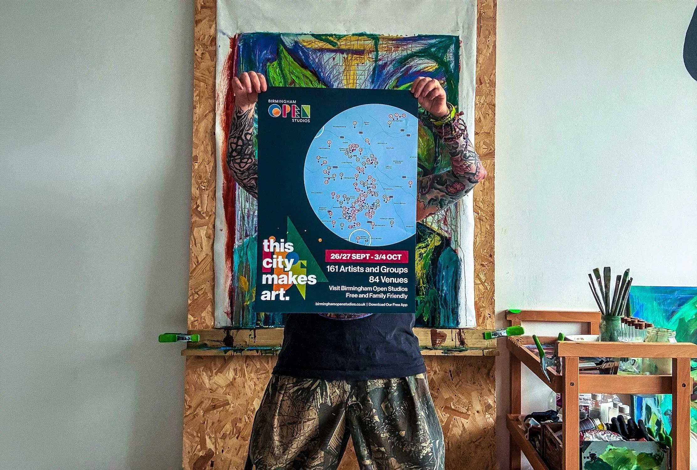
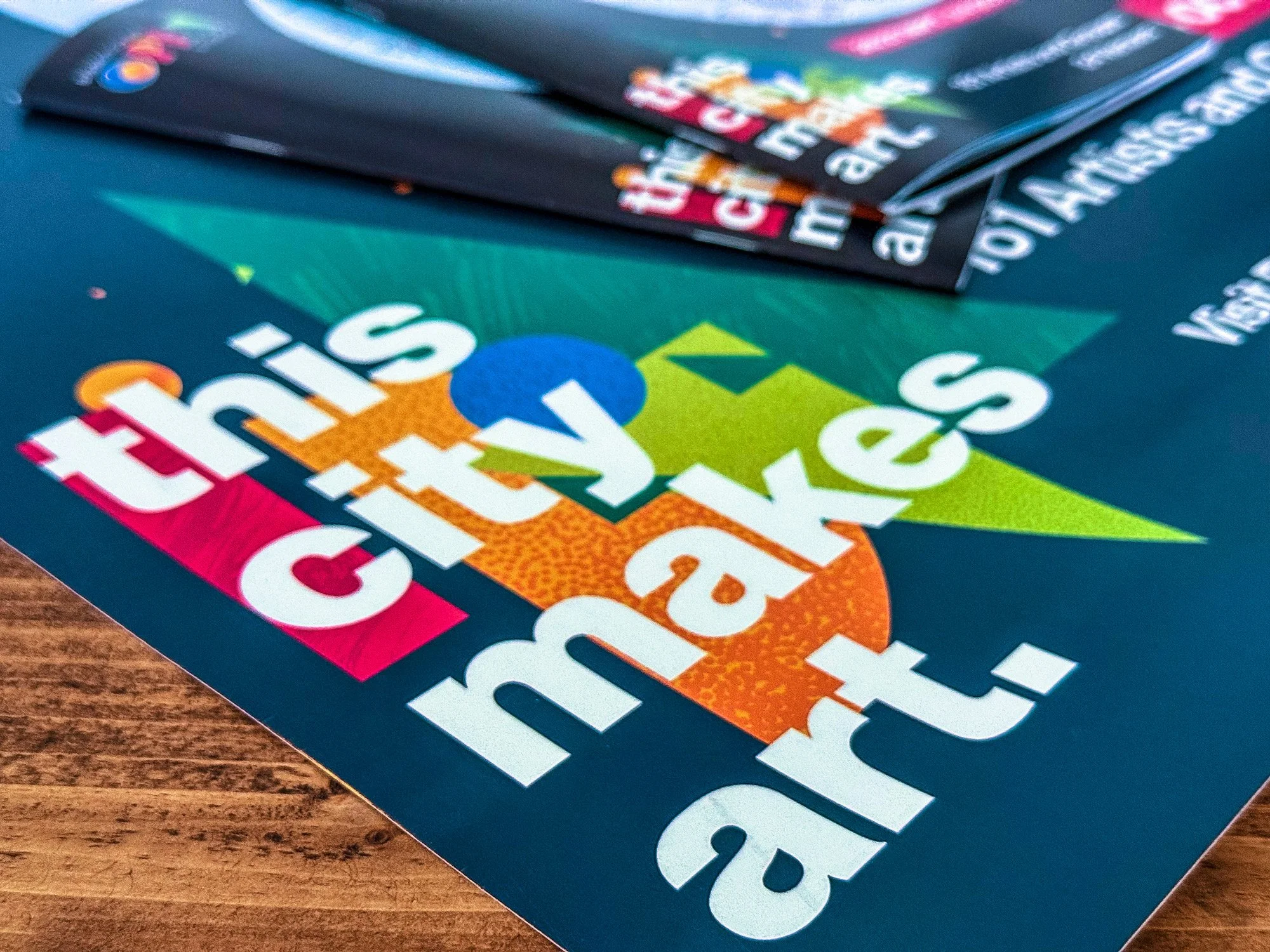
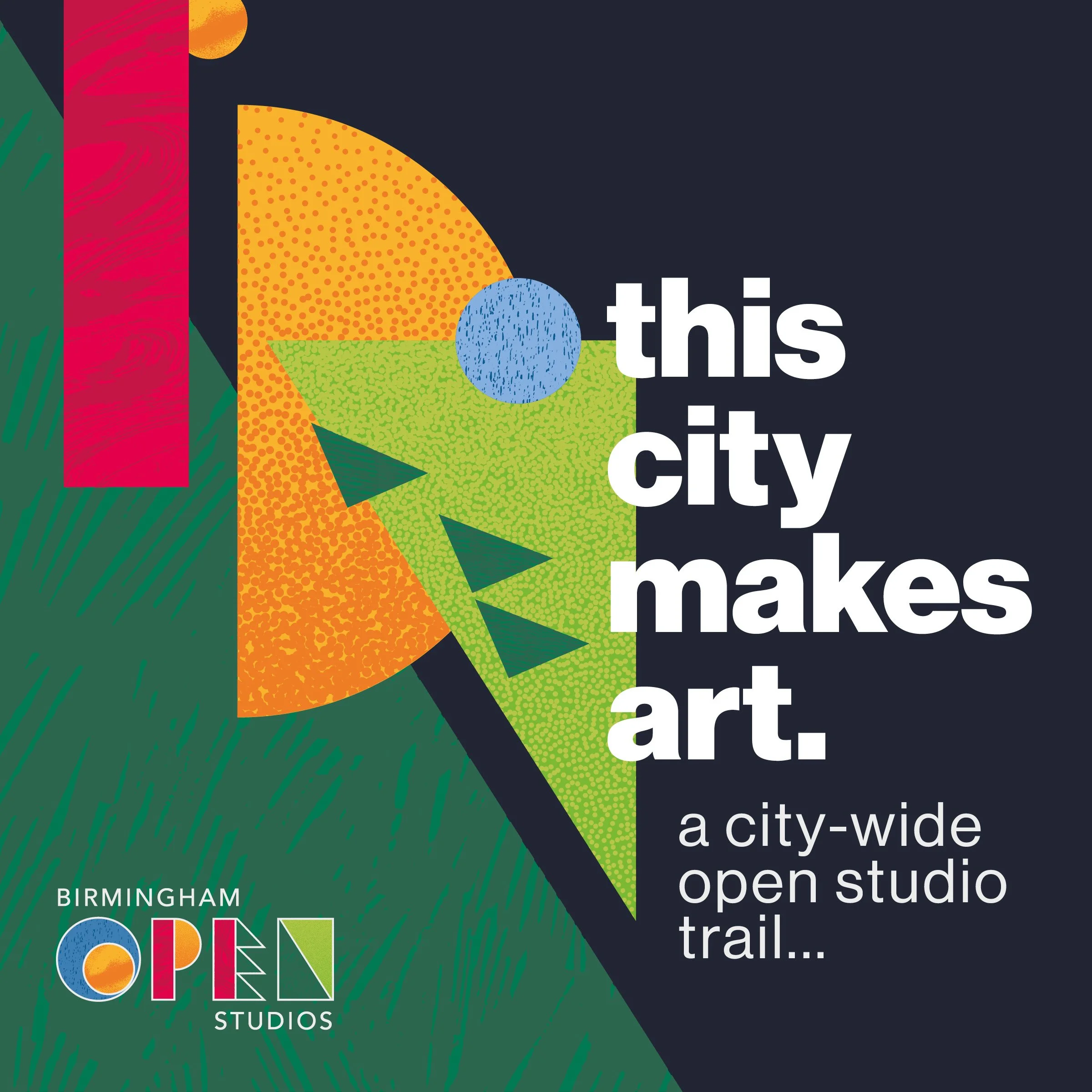
this city makes art.
Simple, bold and unmistakably Birmingham, the campaign became a platform for celebrating the city's creative community across posters, banners, social media and printed communications.
Bringing the Brand to Life
The project extended far beyond the identity itself.
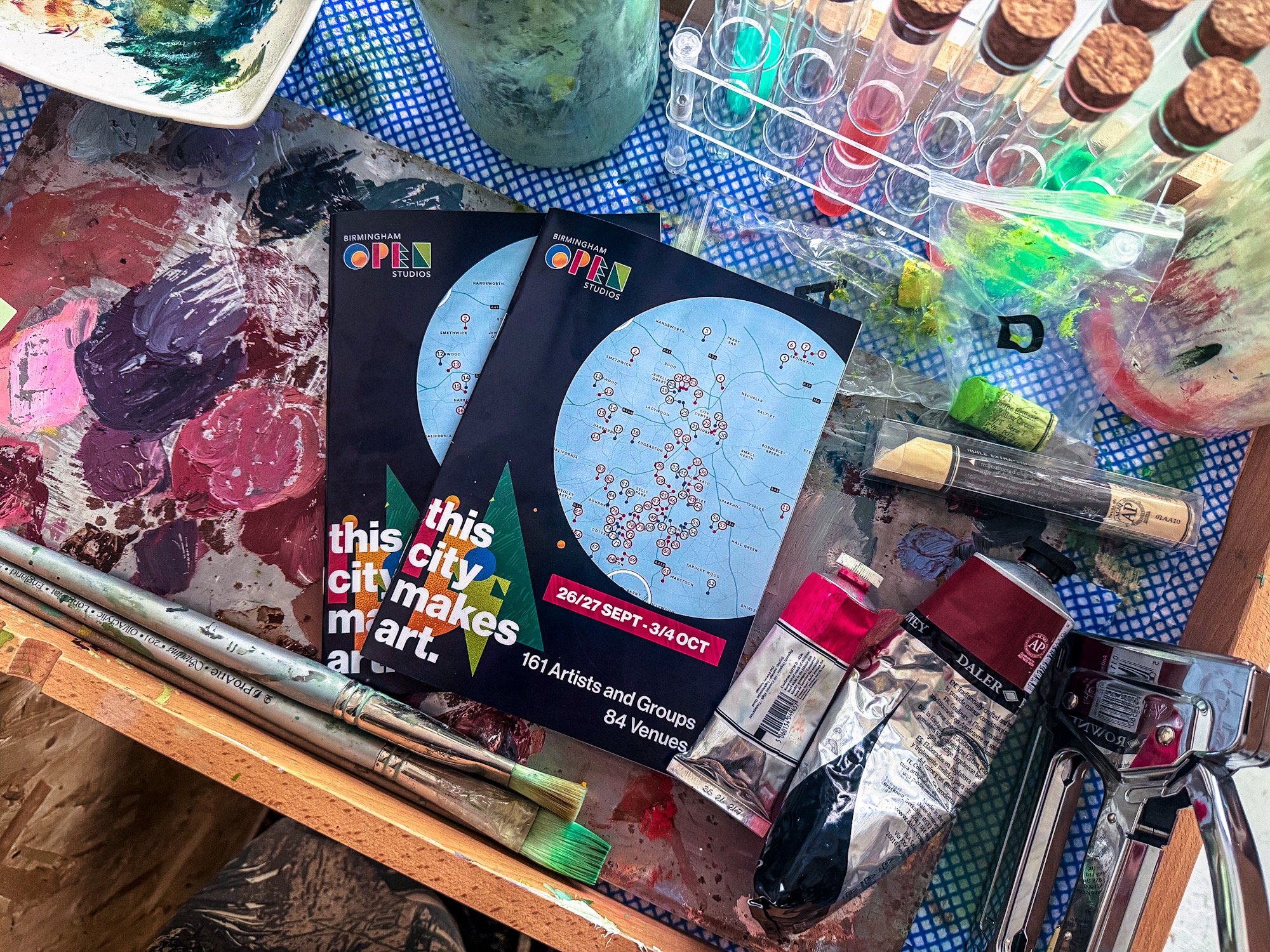
Alongside comprehensive brand guidelines, we developed a practical toolkit including artist assets, venue templates, social media graphics and campaign materials, giving Birmingham Open Studios everything needed to confidently roll out the refreshed brand across the city.
Review
“I am founder and co-director of Birmingham Open Studios CIC. We asked YST to help us improve our art trail's visual image output, and to achieve brand consistency across all platforms, as our previous output was generally too messy and inconsistent.
Working with YST was a dream, and they delivered beyond our expectations. They brought lots of their own ideas while still showing understanding of our brand's identity and focus. All their ideas were explained to us in an excellent presentation. This made the design, purpose and thought processes behind the project easy to understand, and visually easy to digest.
As a visual artist, Project Leader Emma really understood what we were looking for, and had a genuine passion for our project. Emma provided more templates, solutions, and brand imagery than we expected, giving us an excellent pool of stunning graphics and templates to draw upon for years to come.
The rebrand is striking, unique and stands out from the crowd. It gives Birmingham Open Studios CIC a consistent identity, which is instrumental in gaining recognition and attention.”
Owen de Visser (Birmingham Open Studios Founder)
Birmingham Open Studios
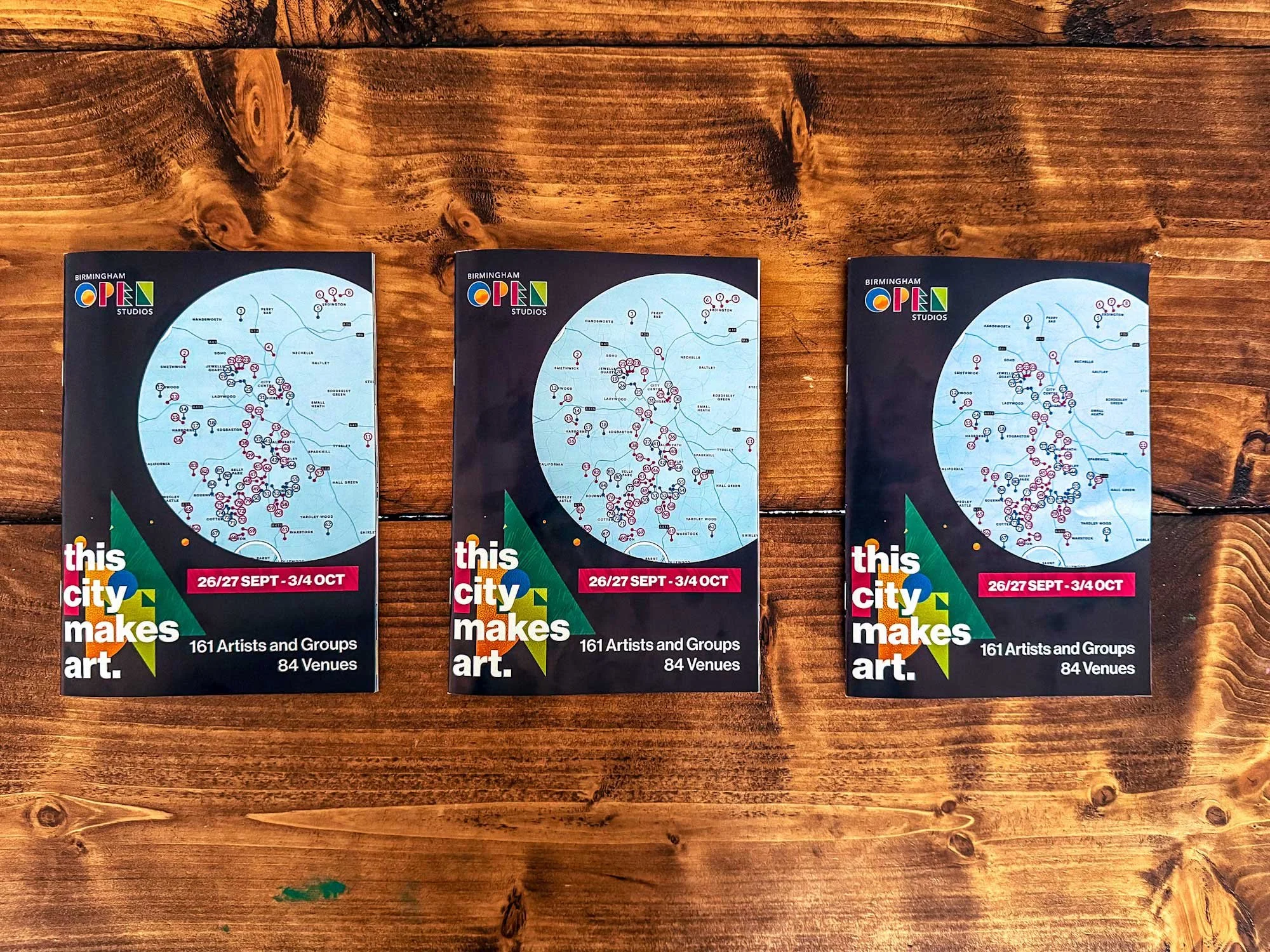
Designed for the city that makes art.
By evolving rather than replacing the existing identity, Birmingham Open Studios now has a brand that feels both familiar and confidently future-facing.
From a refined identity and campaign platform to practical toolkits and brand guidelines, every element was designed to help the organisation grow, support its artists and celebrate Birmingham's creative community for years to come.